Welcome to
Ron’s COVID-19 Page
Who We Are
This site shares the results of an ongoing personal project to better understand why the pandemic developed in such a damaging way in Canada, what other jurisdictions have done to better protect their citizens from those impacts and what we can collectively do to reduce the possible carnage from futures wave caused by this rapidly-evolving virus. It neither represents nor receives funding from any other person or organization. The sole purpose is to provide the latest and most meaningful data and insights related to the pandemic and its impact on our society in a readily accessible format. You will find many meaningful charts and analyses which provide context for the statistics summarized in the above table by clicking on the Global, Canada, Ontario and Kingston menus. For more details, see the About page.
Weekly Pandemic Update
April 26 to May 2

Once again, the most recent official statistics on COVID-19 infections suggest that the seasonal decline in new infections appears to be continuing, at least here in Ontario.
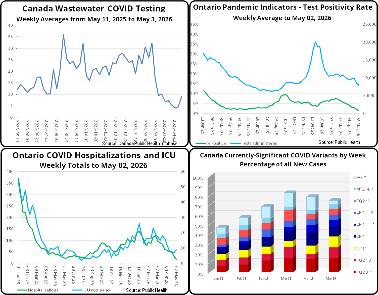
Nationally, as you can see from this week’s composite chart, Canada-wide municipal wastewater COVID viral counts seems to have bottomed out, with a moderate rise in the past week which brought overall counts to slightly below those of last year at this time. In Ontario, however, positive PCR COVID test results continued their seasonal decline, falling below those of last year at this time. Ontario COVID hospitalizations have likewise fallen below last year’s levels.
As the independent statisticians at COVID-19 Resources Canada now report on a monthly basis, there has been no update to their most recent estimate of in every 273 Ontarians being currently infected and therefore infectious. Considering the other data summarized above, I would expect that the actual risk of infection will have declined at least slightly.
Public Health Canada’s latest biweekly report on the relative “market shares” of currently-circulating COVID variants is worthy of note in that the newer PQ family of Omicron variants is now responsible for more new Canadian COVID infections that the XFG, which had been dominant for much of the year to date. Consistent with the recent trend of fragmented viral families with no one strain even close to actual dominance, the two most prevalent strains, PQ.2.8.1 and PQ.2.1.3, respectively account for 15% and 11% of new cases. Collectively, the PQ family now accounts for 44.1% and the XFG family 41.3%. Again, there is no evidence of significant difference in the relative symptom severity of all the currently-circulating strains.
